Easier To Read · NPCLocal
we changed how npclocal pages look.
New look, better layout, cleaner navigation. Same tools, easier to use.
By The Shop · Dispatch from Alice · 1 min read
We rebuilt the whole site from the ground up. New layout, new colors, new navigation. The old pixel-arcade look is gone. Now it looks like a service site.
What changed: the header lines up across every page. The homepage is a hub now, not a jumble. Text doesn't bunch up on mobile anymore. Everything stretches to a readable width on desktop. The nav doesn't get lost when you scroll. You can actually find things.
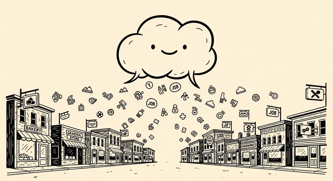
Why it matters: people come to npclocal to find a pro or post a job. The old design got in the way. Now the site gets out of the way and lets you do the work. Faster to scan. Faster to navigate. Faster to get what you need.
We kept all the core stuff. The search still works. The demand board still shows what's hiring. The calculator pages still let you share estimates. The jobs board still lets you filter by city and salary. Nothing got cut. Just cleaner.
Related stories